
How to Choose the Perfect Color Palette for Your Wedding Décor
Every family has a different idea of what the perfect wedding looks like. Some want big and bright — lights everywhere, flowers from floor to ceiling, a dance floor that stays full till 2 AM. Some want simple and classy — soft colors, clean setup, the kind of décor that looks good without trying too hard. But one thing every wedding has in common? The color choice either pulls everything together or makes it look confused. And most families only figure this out after the wedding is done.
We have planned and decorated weddings across Chandigarh, Punjab, Kasauli, Shimla, Solan, and Dehradun — big fat Punjabi weddings, intimate hill resort ceremonies, everything in between. This guide is based on what we have actually seen work and what has not. No fancy design theory, just practical things you need to know before you lock in your color palette.
First, decide the vibe of your wedding
Before you think about colors, think about the feeling you want. Do you want guests to walk in and feel like they are at something grand and royal? Or something warm and close, like a big family gathering done beautifully? That feeling — that vibe — should drive every color decision.
Here is a simple way to think about it. There are four basic wedding styles. Pick the one that feels closest to what you are imagining, and the right colors will follow:
Timeless. Safe. Always looks beautiful in photos. Works in any venue — hotel, farmhouse, or resort. If you’re not sure what style you want, this one never fails.
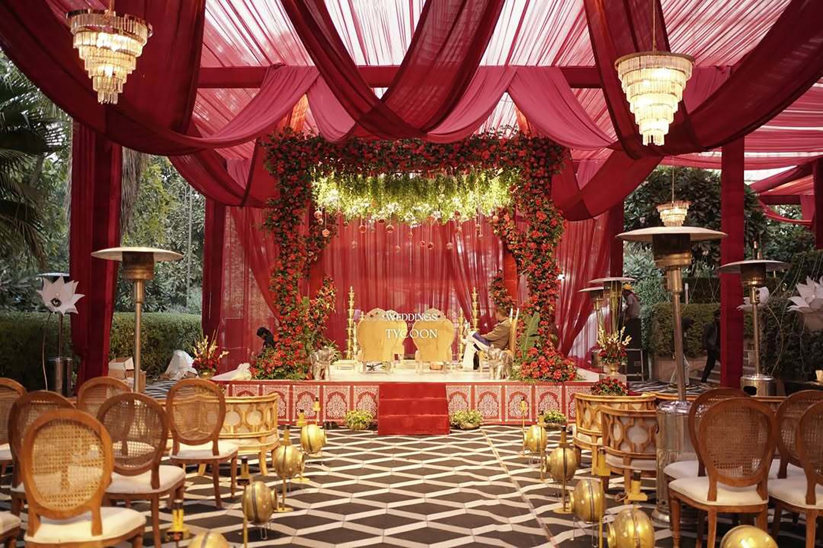
Rich, heavy, dramatic. Perfect for big weddings in large banquet halls. Needs a lot of space to look right — in a small venue these colors can feel heavy.
Clean and sharp. Looks very modern in photos. The tricky part — at a big Punjabi wedding, this palette can feel too quiet. It works best for intimate events of under 200 guests.
Warm and nature-inspired. Looks stunning at farmhouse weddings and outdoor venues. Ideal for Mehendi or Haldi setups. Not the best fit for a formal five-star ballroom.
Let the season guide your colors
Nature is the best décor planner there is. The colors that feel right in February are different from the ones that feel right in October — and there is a reason for that. The weather, the outdoor light, even the mood of the season all affect how colors look and feel. Work with the season and you are already halfway there.
How colors work together
You do not need to study design to understand this. There are basically four ways colors can work together, and knowing which one you are going for makes a huge difference in how your final décor looks.
For most Indian weddings, opposite colors work the best — because our décor is naturally bold and layered. The contrast gives everything room to breathe and makes each element stand out clearly.
The 60-30-10 rule — simple but powerful
This is one of the most useful things we share with every couple. The idea is simple: use three colors in a 60-30-10 split. Most of the room is your main color. A smaller part is your second color. And just a little bit is your highlight or accent color. This keeps the décor balanced so no single color is fighting for attention.
Is there a situation where you can ignore this rule? Yes — the Sangeet. A Sangeet is supposed to be high energy, loud, fun. If you want your Sangeet setup to be maximalist and colorful, go for it. The rule is a guideline for when you want balance. When you want drama, all rules go out the window.
Your venue already has a color
This is the one that surprises most families. Your venue is not a blank white canvas. It already has colors — the flooring, the walls, the ceiling height, the kind of light it gets. If you pick your palette without thinking about this, you might end up with colors that fight the space instead of working with it.
| Venue type | What it already looks like | Colors that work well | What to avoid |
|---|---|---|---|
| 5-star hotel ballroom (Hyatt, Taj, JW Marriott, Chandigarh) | Warm cream walls, gold fixtures, soft-toned flooring | Champagne + blush, jewel tones + gold, ivory mono | Cool grey and silver — they fight the warm feel of the space |
| Hill resort venue (Kasauli, Shimla, Dehradun) | Stone walls, pine green surroundings, natural wood | Earthy tones, sage + terracotta, navy + white, burgundy + green | Bright neon colors or tropical shades — they look out of place against mountains |
| Outdoor farmhouse (Panchkula, Zirakpur) | Green grass, open sky, natural daylight | Almost any palette — most flexibility here. Pastels for daytime, rich tones for evening | Very dark colors that disappear at night without strong lighting |
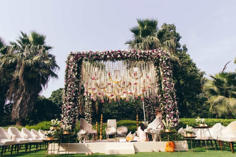
| Garden or lawn venue | Green plants, natural light all around | Blush + white, lavender + sage, peach + terracotta | Too many artificial-looking colors that compete with the natural greens outside |
Lighting changes everything
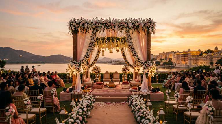
Honestly, this is the thing most families do not think about and then regret later. The color you choose in daylight will not look the same under event lighting. And in North India, most wedding venues use warm amber-yellow lighting in the evening. This is not a problem — but you need to choose your palette with this in mind.
- Warm golden lighting (most common at Indian weddings) Makes reds, oranges, pinks, and creams look richer and more beautiful. But it can wash out cool colors — your blue draping might look a bit dull, your grey might look yellow. If your venue uses warm lights, your color palette should also lean warm.
- Cool white lighting Makes blues, purples, and silvers pop. But it can make warm colors like blush look pale and flat. A lot of modern minimalist weddings go with cool lighting — but then the palette also needs to be cooler to match.
- Natural daylight (morning functions like Haldi, Mehendi) The most forgiving light there is. Any color looks good in good natural light. Just remember — if your function goes from morning to evening, the same décor will look different once the sun sets and the event lights come on.
- Colored stage lighting for Sangeet If you have blue, purple, or green wash lights on the stage during Sangeet, those lights will completely change how your décor colors look. The stage production is more important than the draping color at that point. Do not stress too much about the décor palette for a highly produced Sangeet night.
How to make a mood board that actually helps
Almost every couple today comes with a mood board — a collection of images from Pinterest and Instagram showing what they want the wedding to look like. This is a great starting point. The problem is when the mood board has 50 different images from 50 different kinds of weddings with nothing in common except that each image looked nice on its own.
Here is how to make a mood board that your décor team can actually use:
- Start with your outfit colors — nothing else matters more Get a fabric swatch of your lehenga or at least a clear photo of it. If you are the groom, bring your sherwani or suit color. This is the anchor. Everything in the room on your wedding day should make your outfit look its best.
- Add photos from your actual venue if you can find them If another couple has had their wedding at the same venue, look for their photos. Photos from the same space — same flooring, same ceiling, same natural light — are ten times more useful than photos from a completely different venue. Ask us — we have photos from most venues we have worked at.
- Be specific about what you like in each photo Do not just say “I want this.” Tell us what specifically appeals to you — is it the color of the flowers? The height of the stage? The way the candles are placed? The more specific you are, the better we can deliver.
- Keep it to 10 or 12 images maximum A mood board with 60 photos is actually harder to work with than one with 10 good ones. If two photos are saying the same thing, remove one. If two photos are saying opposite things, decide which direction you actually want to go.
- Share it before you fall completely in love with it The best time to give feedback on a mood board is early — when we can still say “this color combination is going to be very hard to pull off in your venue” without it being a problem. Once the mood board is locked and vendors are booked, changing direction costs money. Changing it at the idea stage costs nothing.
Questions we get asked all the time
Three is the sweet spot — one main color, one supporting color, one accent. Two works beautifully for a clean, simple look. Four is possible if you are experienced with décor. Five or more, and things start to look messy unless you have a very experienced team managing it. The 60-30-10 rule we mentioned earlier is specifically designed to keep three colors in balance.
Yes, and we actually recommend this. Each function has a different mood and energy — the Mehendi is daytime and playful, the Sangeet is high energy at night, the wedding is the main event. Having a different palette for each makes your wedding album look varied and interesting rather than the same look repeated three times. The one thing we suggest is keeping some common element across all three — a specific flower, a particular shade, something that ties the whole celebration together.
The décor should frame the lehenga, not match it. If you are wearing a deep red lehenga against a deep red backdrop, you will blend in. Instead, pick a backdrop that contrasts with your outfit. Deep red lehenga? Go with an ivory or champagne backdrop with some gold detail. The bride should stand out from the décor, not become part of it.
White as the main décor color is something to think carefully about. In many Hindu traditions, white is associated with mourning, so using it as the dominant color for a wedding ceremony can feel uncomfortable for older family members even if it looks beautiful in photos. Using white as an accent or mixing it with warm colors like gold or blush is perfectly fine. But leading with a fully white décor theme for a traditional ceremony is worth discussing with the family first before committing.
At least 6 to 9 months before the wedding for the main palette. The reason: some fabrics, specialty flowers, and custom props need to be ordered in advance — and they are ordered in your specific colors. If you change colors at the last minute, it creates problems. For destination weddings in Kasauli, Shimla, Dehradun, or Solan, where vendors need more lead time, earlier is better. We typically have this conversation in our very first meeting with a couple, which is usually 10 to 16 months before the wedding date.
Not sure where to start? We’ll figure it out with you.
At Weddings by Tycoon, we have our own in-house décor team — which means the people who plan your colors are the same people who execute them on the wedding day. No middlemen, no guessing. We work across Chandigarh, all of Punjab, and at destination venues in Kasauli, Shimla, Solan, Kandaghat, and Dehradun. Come in for a free consultation — bring your lehenga swatch, your venue shortlist, and your mood board. We’ll take it from there.
Book a Free Consultation